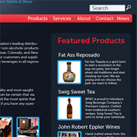
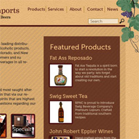
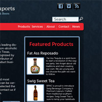
Please help a Houston independent liquor beer and wine distributor improve their website by voting for the design concept you like best. Any comments or feedback would be greatly appreciated.
Help a Houston Liquor Distributor Improve their Website by Providing Feedback
6 Responses »
Leave a Response


I like the one on the right
I’m with J.R. Dig the one on the right. It feels warmer, and more in line with the product offerings. Good work!
Top right, BTW.
Thanks @jrcohen & @leftlane for the feedback. I appreciate it.
-@Chris_Olbekson
J.R.’s a fuddy duddy, and you can tell ‘im I said so.
I like the one on the left — cleaner, edgier, more in keeping with the product line. And, perchance you have this in mind to suggest to that local retailer you mentioned on Twitter, definitely go with the red & black.
The retailer mentioned on Twitter really needs help!!
Thanks for the comment. This is actually for a client. They mainly do on premise and wholesale. No retail.